Missed Team ’24? Catch up on announcements here.
×Community resources
Community resources
Community resources
Guide to Customizable Jira Dashboards and Analytics
In Jira, a dashboard is a customizable interactive page visually representing relevant information from your projects. Dashboards help users track, analyze, and share information about their projects and team progress. They can be customized to meet the specific needs of different users and roles in the organization.
For those who have already met them, it's no secret that dashboards are a way to respond quickly and track various processes in the here and now.
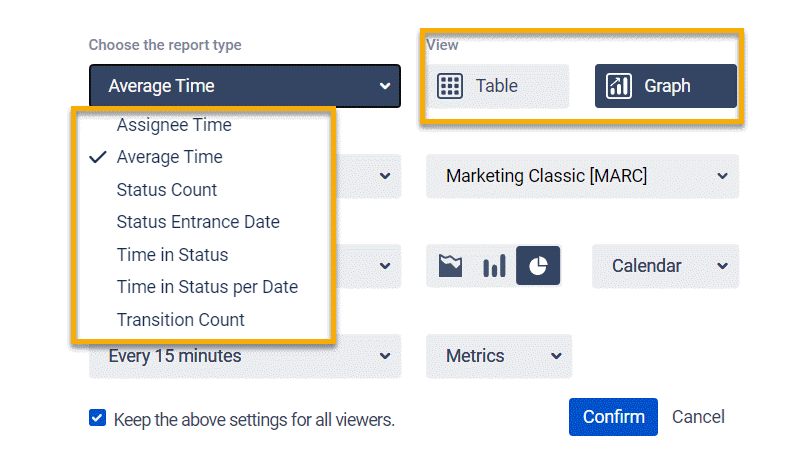
There are a lot of gadgets out there. One or the other is useful for different teams. The Time in Status for Jira app offers virtually all of its reports in grid and chart views:
- Time in Status,
- Assignee Time,
- Average Time,
- Status Entrance Date,
- Status Count,
- Transition Count,
- Time in Status per Date
Let's create a Jira dashboard using only the gadgets of the Time in Status app.
Creating a Jira Dashboard
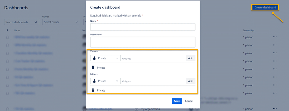
So, let's start with the fact that you must create a Jira dashboard first. Go to the Dashboard tab in the top menu.
Next, click the Create Dashboard button and set the permissions for your new dashboard. You can choose who can view this dashboard, who can edit it, or you can make it completely private.
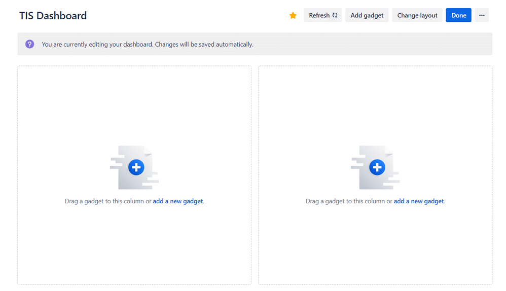
And that's it; now you have a ready-made dashboard.
Let's start filling it in.
Time in Status Dashboard Gadgets
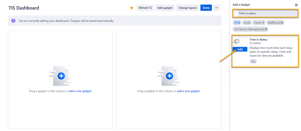
First, you need to install the app from Atlassian Marketplace, then find Time in Status in the list of gadgets in the right column and click the Add button.
The gadget will appear in the first section, and you can configure it.
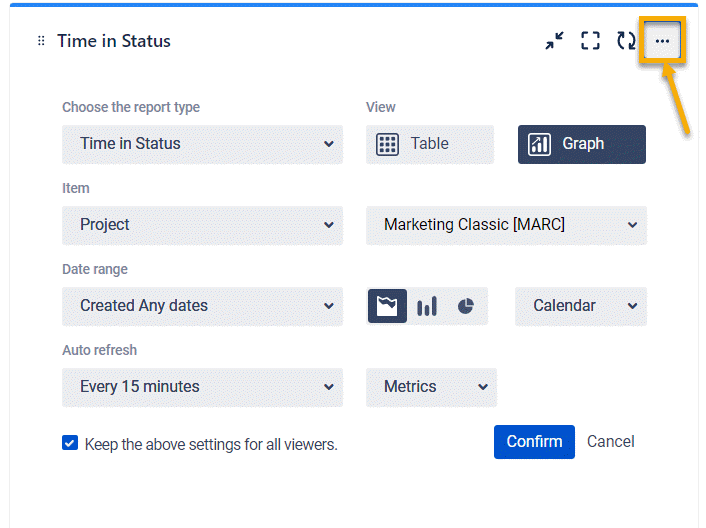
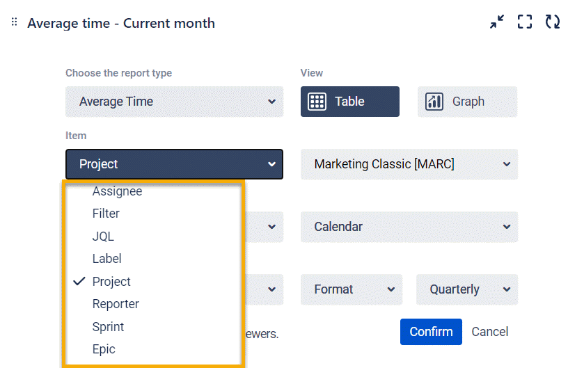
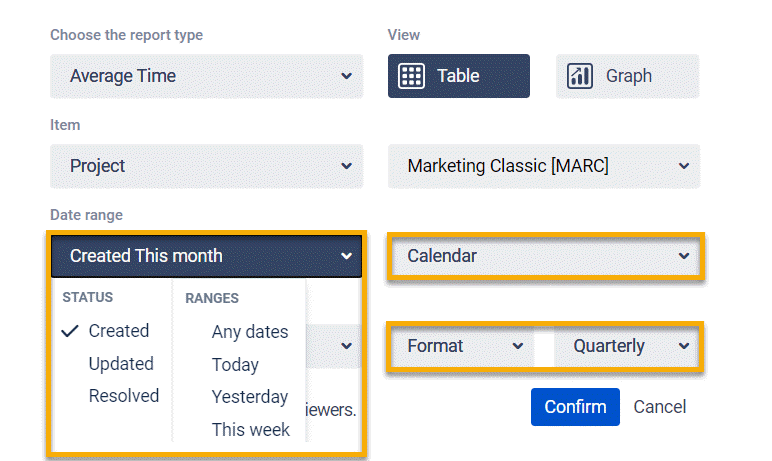
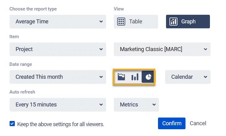
Next, in the settings, you have access to advanced gadget customization functionality:
- one of 7 reports and a choice of table or chart view;
- a wide range of filters;
- date ranges, selection of the working calendar, and the required format for display;
- and, of course, you can choose from three types of charts.
Note that you can also set the parameters for updating information on gadgets. At a minimum, auto-refresh occurs every 15 minutes.
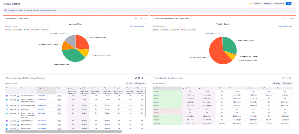
Here's what the dashboard looks like with some reports from the Time in Status app added.
So, which reports did we choose for our dashboard.
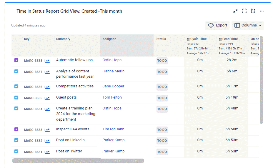
Time in State Report
Previously, the Cycle and Lead time calculation group statuses were set up. You can customize the grid view using the Column Manager to ensure you have only the necessary fields at your fingertips.
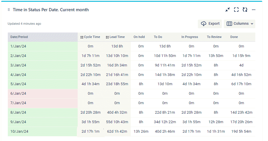
Time in Status per Date Report
The Time in Status per Date report sums up the time the task has been staying in each status at a particular date.
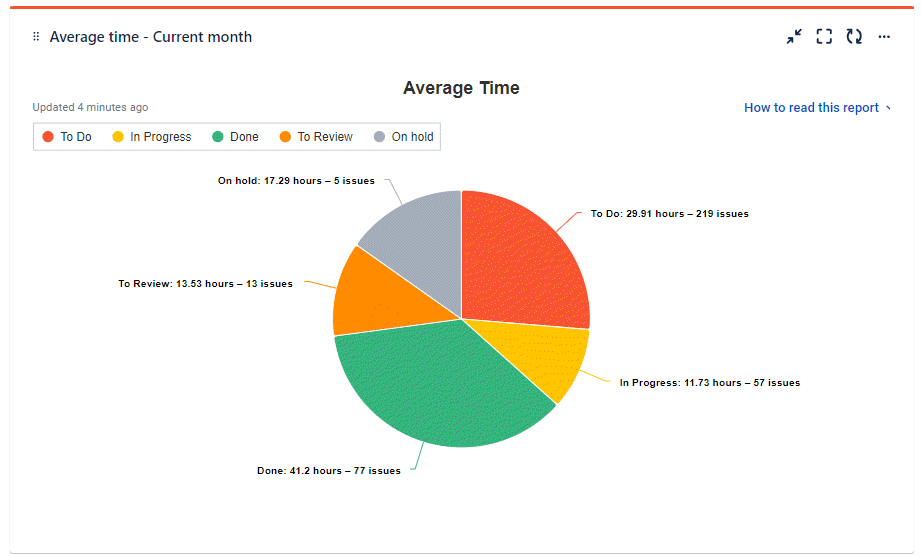
Average Time Chart
One of the most popular reports and charts. The Average time report shows the average time issues have been staying in statuses during a specific period.
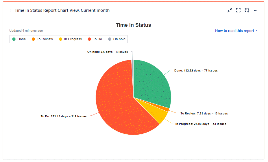
Time in Status Chart
If a grid view is necessary for a specific list of tasks and their indicators, then the Time in Status chart is necessary for visualizing these indicators.
It's no secret that graphical views are designed for analytics and give you a bird's eye view of the situation.
Takeaway
You can set up a lot of gadgets to be displayed on the dashboard. The Time in Status add-on gives you this opportunity. Customize your reports and charts. Create powerful dashboards and always keep your finger on the pulse of your team's performance—a 30-day trial period for you to test other app features.
See you in the SaaSJet team! 🙂
Was this helpful?
Thanks!
Iryna Komarnitska_SaaSJet_

About this author
Product Marketer
SaaSJet
Ukraine
7 accepted answers
Atlassian Community Events
- FAQ
- Community Guidelines
- About
- Privacy policy
- Notice at Collection
- Terms of use
- © 2024 Atlassian


1 comment