


MAIP Rebrand
—
The 4A’s Multicultural Advertising Intern program has been connecting aspiring, diverse students of advertising with prestigious ad agencies across the country since 1973. This project is very special to me because this is the very program that helped me break into advertising. I was fortunate enough to give back by rebranding it.
Role — Designer
Creative Director — Aaron Padin

A Legacy of Butterflies
Looking back at the program's past logos, I noticed that up until the latest one, they all used a butterfly. For this reason, I decided to bring the butterfly back as a symbol of the transformation that the industry is still going through.

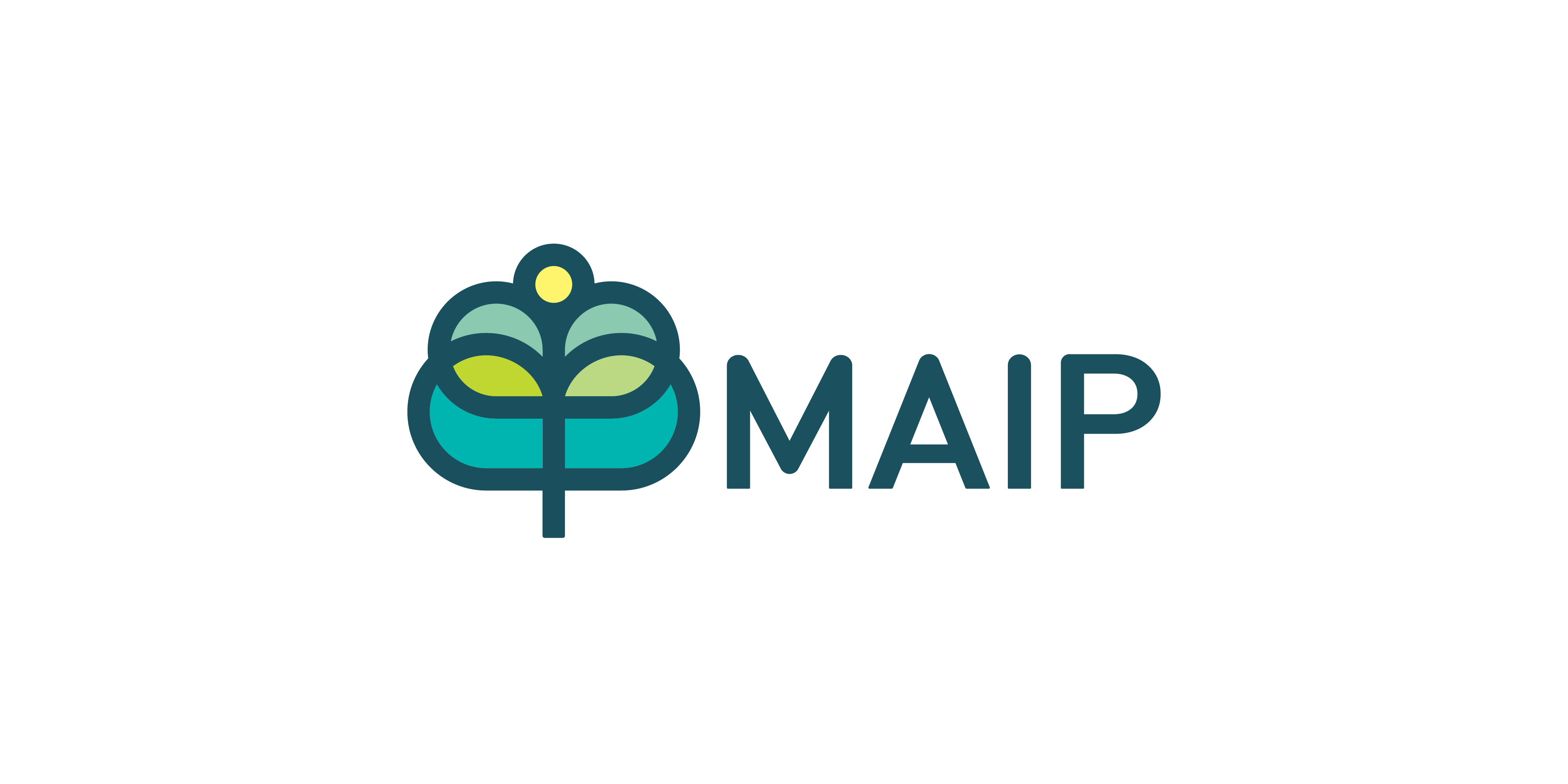
A Timeless Mark
In addition to a butterfly to represent growth and transformation, I incorporated a tree to symbolize the program's history and maturity. The mark also spells out the letters to MAIP. The logotype is a custom font based on Din. The letterforms were manipulated to have both soft and hard sides. Living in harmony with the mark.
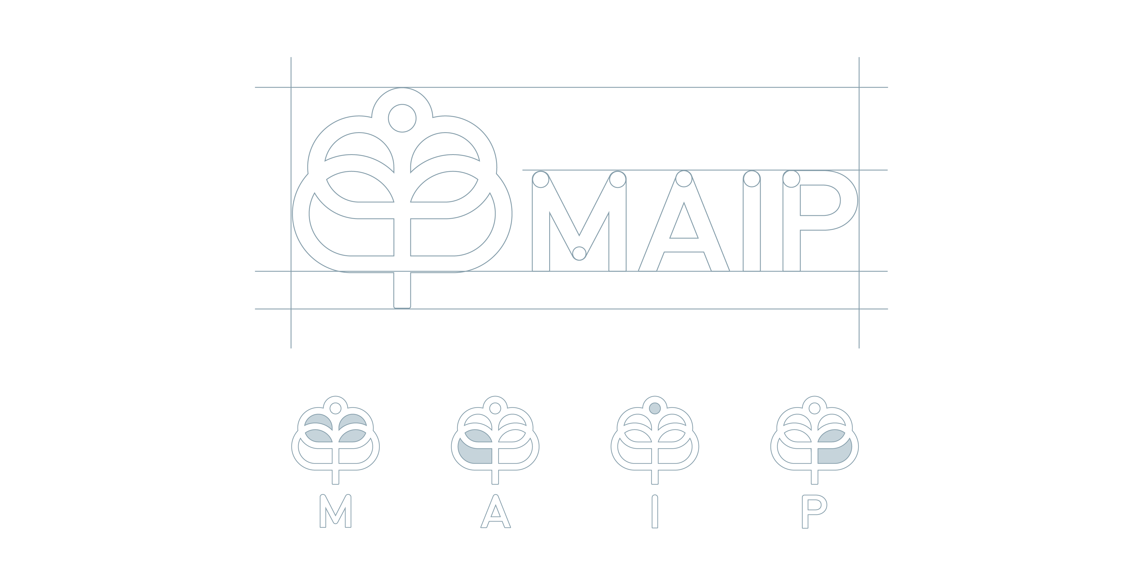
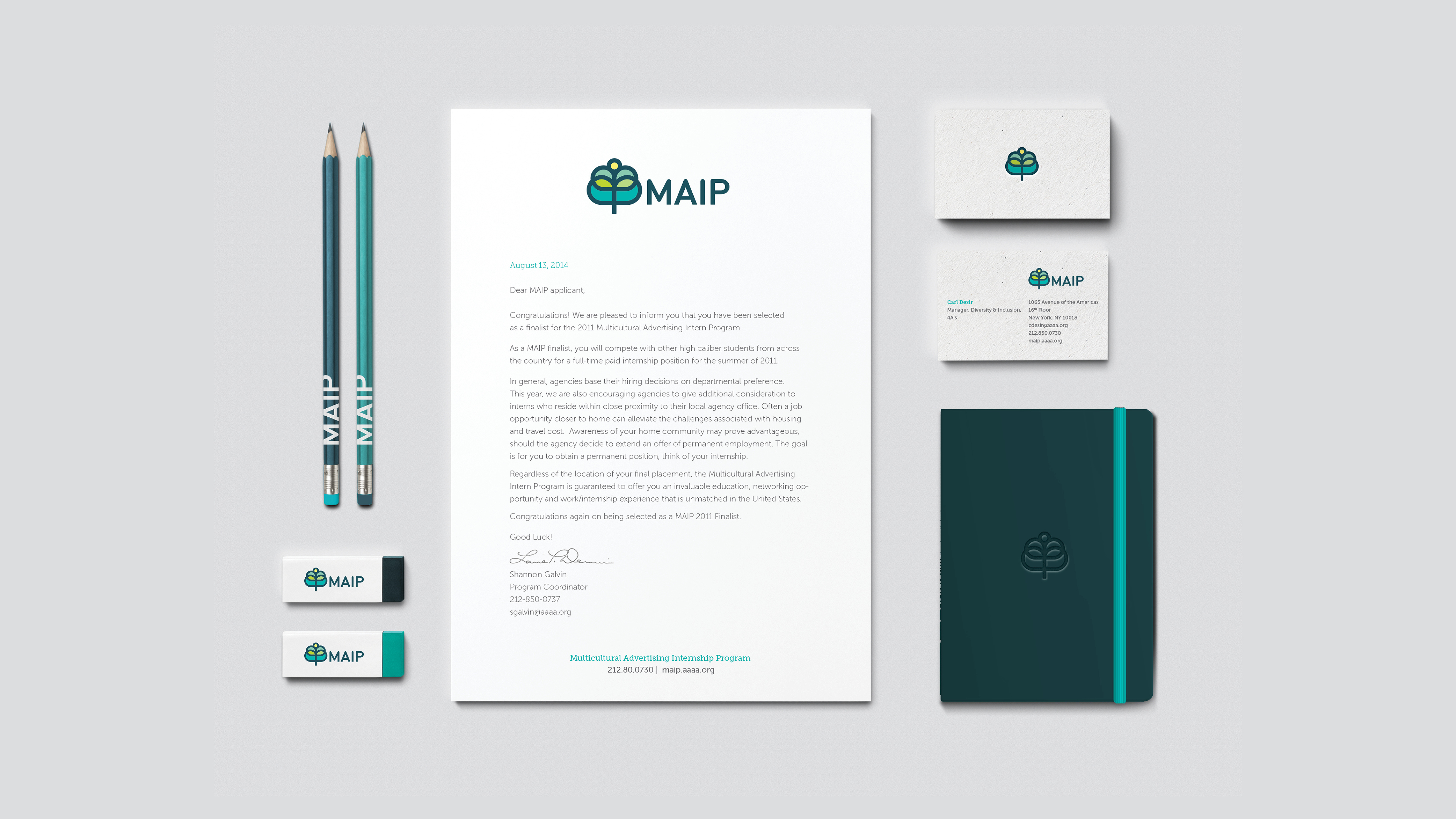
Breakdown
With application of color, the mark starts to look like different things including a tree, flower, hive, a student reading and a butterfly. Each of these symbols represent a different service of the MAIP program.