Politics
This Fascinating World Map was Drawn Based on Country Populations
View this giant map in full resolution to see details
This World Map was Drawn Based on Country Populations
To view this map at a higher resolution to see countries and data with detail, click here
It’s likely you’re very familiar with the standard world map.
It’s shown practically everywhere – you’ll see it online, on the news, in books, and even as a part of company logos. In fact, the world map is so ubiquitous that we don’t even really think about it much at all, really.
The economist Max Roser from Our World in Data argues that this familiarity with the world map may lead to complacency in understanding global matters. After all, the typical world map shows us the basic geography of countries and continents, but it doesn’t give any indication of where people actually live!
Introducing: The Cartogram
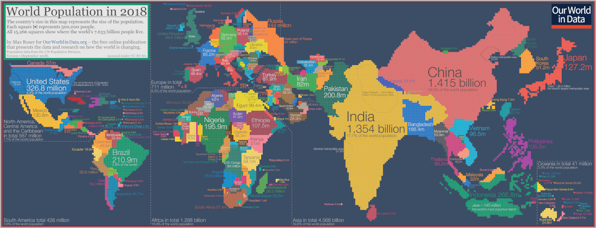
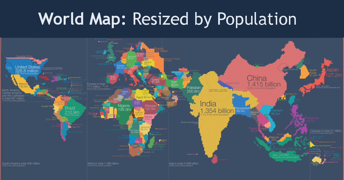
To get around the challenges of relying on the standard world map, Roser instead has made a population cartogram based on 2018 population figures.
What’s a population cartogram?
A cartogram is a visualization in which statistical information is shown in diagrammatic form. In this case, it’s a population cartogram, where each square in the map represents 500,000 people in a country’s population.
In total there are 15,266 squares, representing all 7.633 billion people on the planet.
Countries like Canada or Russia – which have giant land masses but small relative populations – appear much smaller on this kind of map. Meanwhile, a country like Bangladesh grows much bigger, because it has a large population living within a smaller area.
The Regional View
Let’s zoom in on some continental regions to get a sense of what we can learn from a population cartogram done in this fashion.
Asia and Oceania
Where did Australia go? The continent is completely dwarfed by neighboring Indonesia and the Philippines.
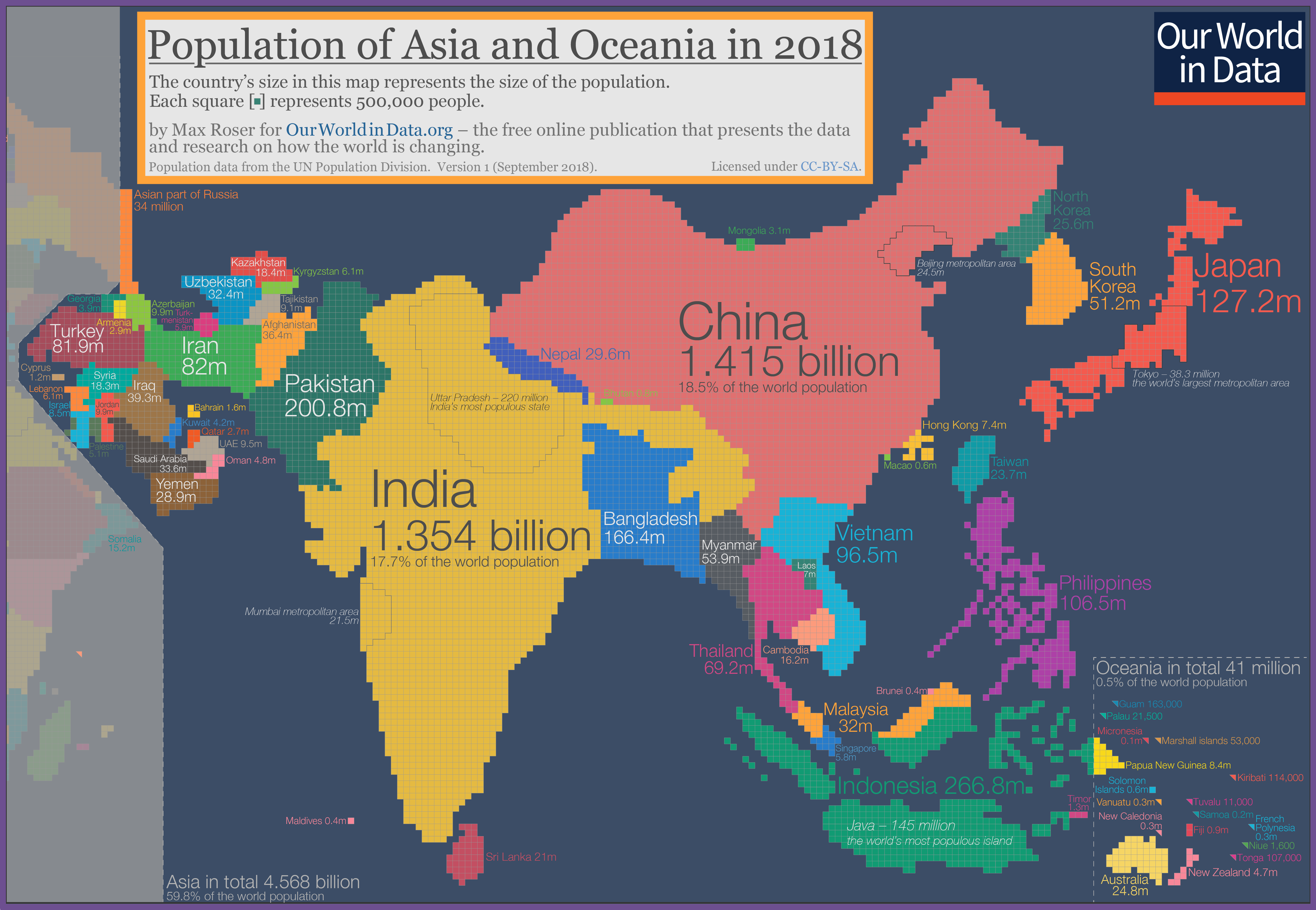
Not surprisingly, India and China are the biggest countries on this cartogram, especially looking oversized in comparison to countries in the Middle East like Saudi Arabia, Afghanistan, or the United Arab Emirates.
Europe
Geographically, Russia is a pretty massive country – but when resized based on population, the nation looks closer in size to many other European nations.
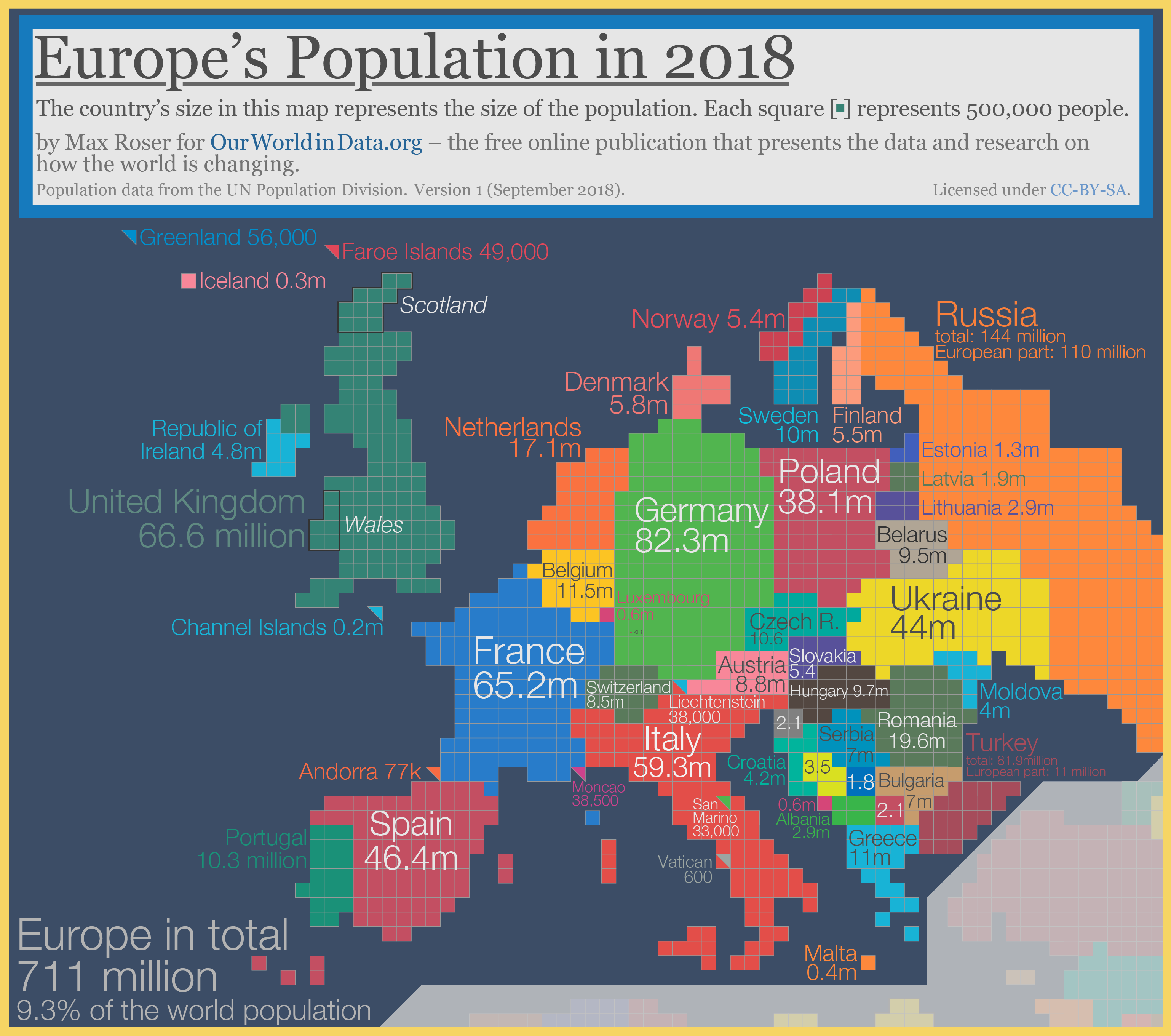
The Netherlands and Belgium, two countries with higher population densities than most European nations, also appear more prominent on this style of map.
The Americas
On the map below, Mexico has exploded to almost 4X the size of Canada. That’s because although the Great White North is the world’s second largest country in size, it only has a fraction of the population of Mexico.
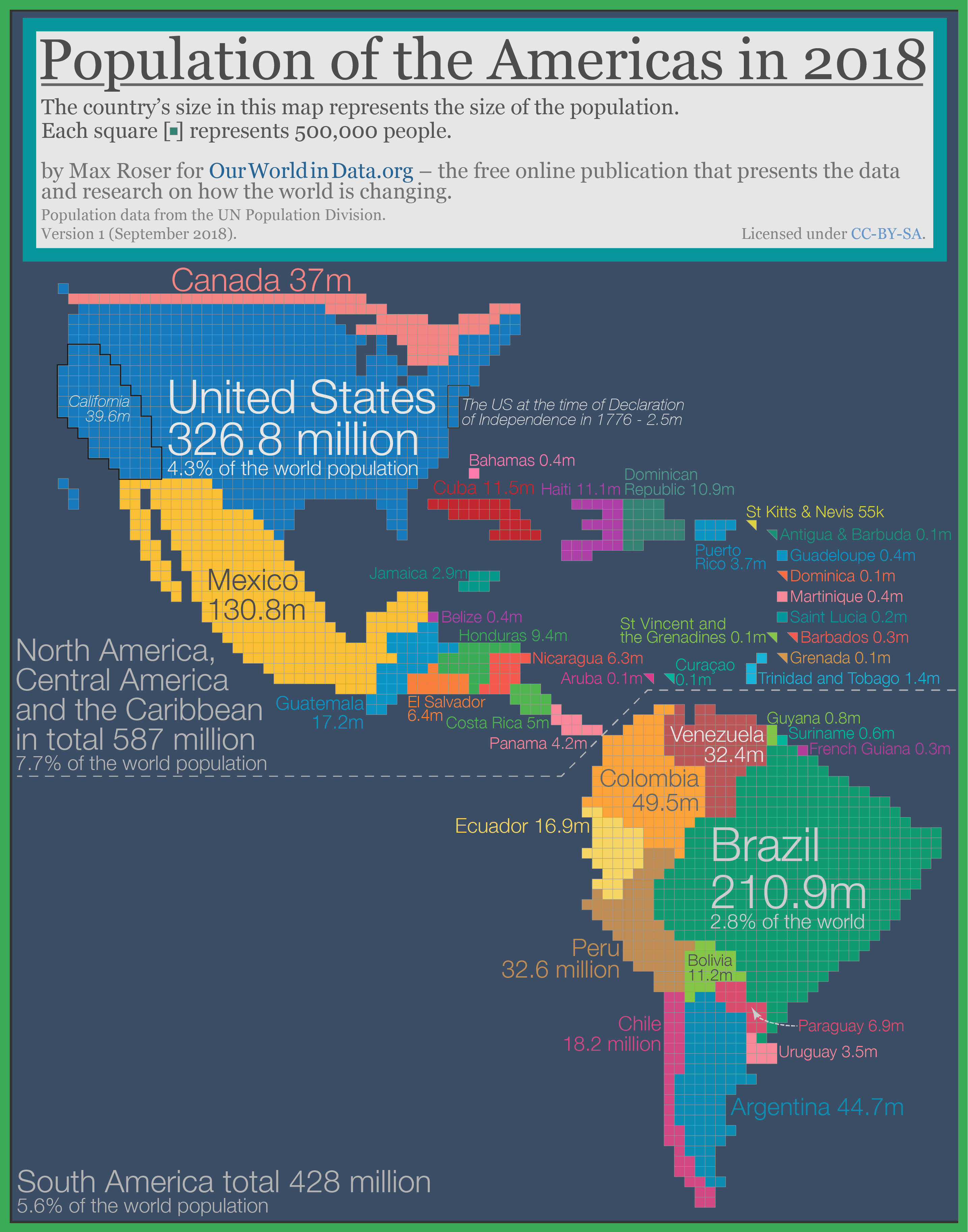
Meanwhile, it’s evident that Argentina’s population is lower than the country’s giant landmass leads on.
Africa
Finally, we’ll look at Africa, which is in the middle of a massive population boom.
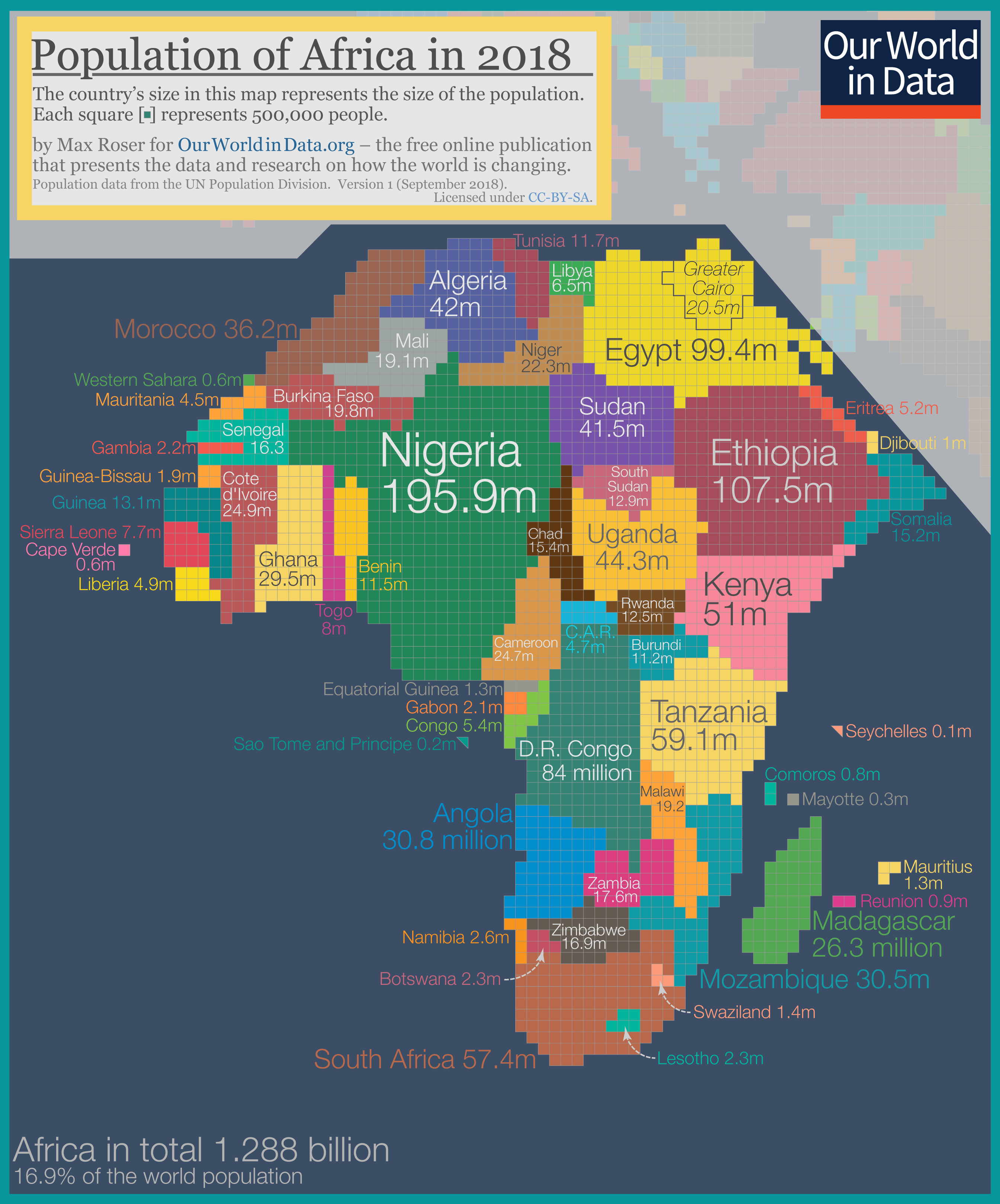
Countries like Namibia, Botswana, and Chad almost disappear.
Nigeria, which is expected to have the world’s largest city by 2100 with over 88 million residents, is the largest country in Africa using this cartogram method.


Politics
The Start of De-Dollarization: China’s Gradual Move Away from the USD
The de-dollarization of China’s trade settlements has begun. What patterns do we see in USD and RMB use within China and globally?


The Start of De-Dollarization: China’s Move Away from the USD
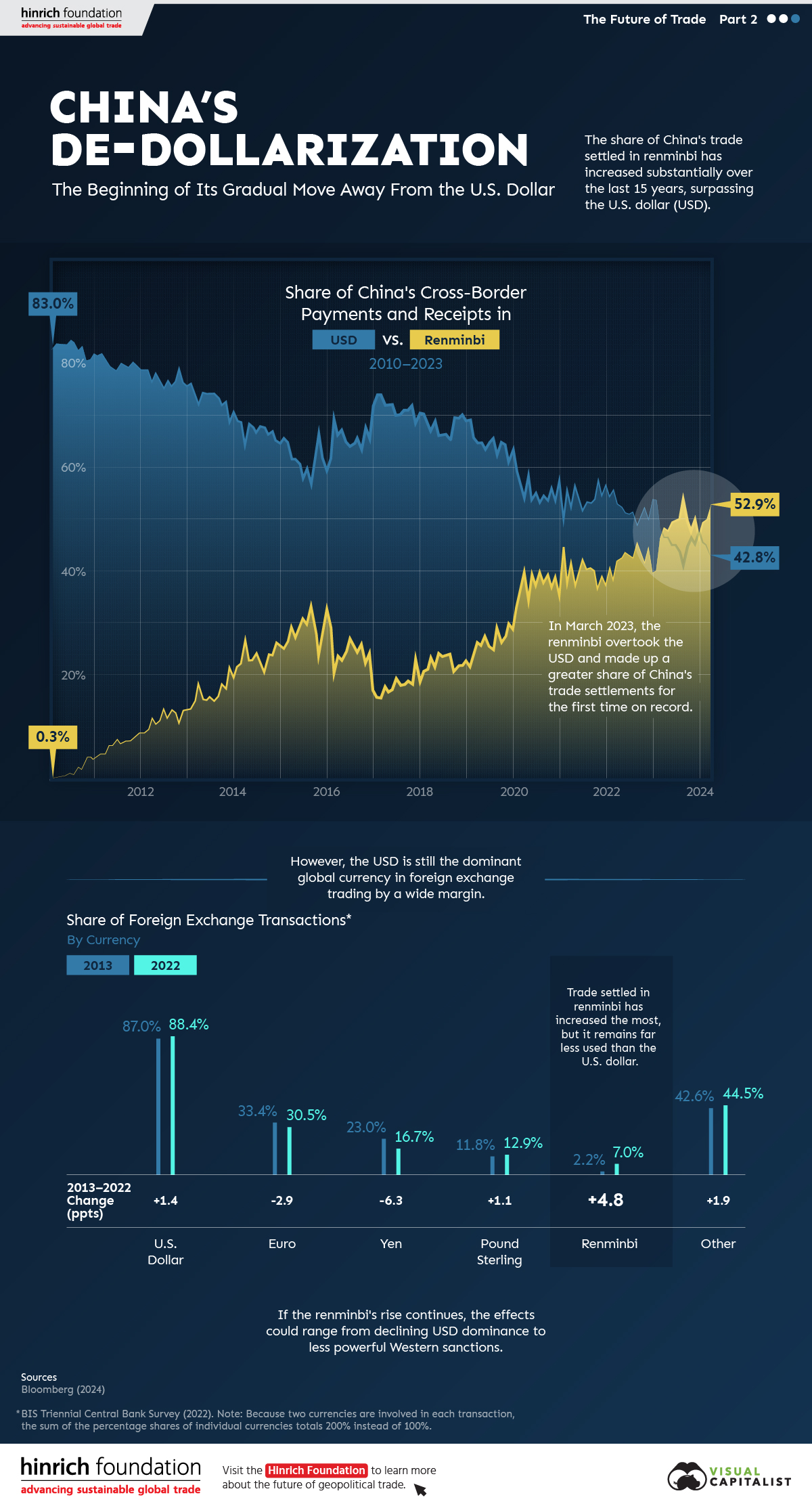
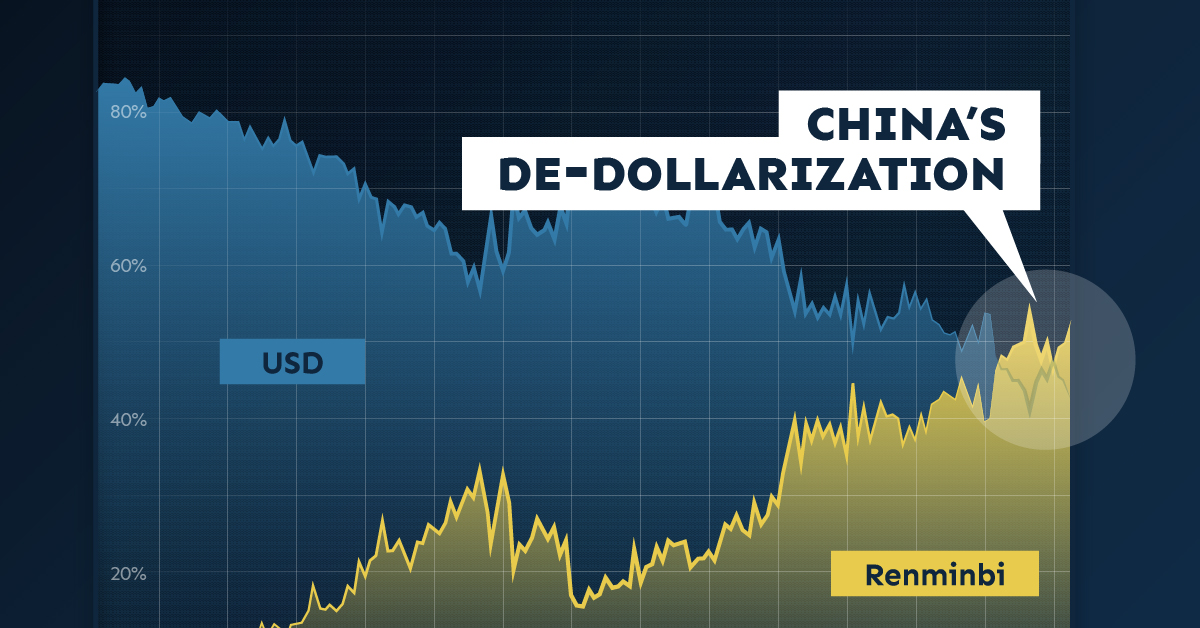
Since 2010, the majority of China’s cross-border payments, like those of many countries, have been settled in U.S. dollars (USD). As of the first quarter of 2023, that’s no longer the case.
This graphic from the Hinrich Foundation, the second in a three-part series covering the future of trade, provides visual context to the growing use of the Chinese renminbi (RMB) in payments both domestically and globally.
The De-Dollarization of China’s Cross-Border Transactions
This analysis uses Bloomberg data on the share of China’s payments and receipts in RMB, USD, and other currencies from 2010 to 2024.
In the first few months of 2010, settlements in local currency accounted for less than 1.0% of China’s cross-border payments, compared to approximately 83.0% in USD.
China has since closed that gap. In March 2023, the share of the RMB in China’s settlements surpassed the USD for the first time.
| Date | Renminbi | U.S. Dollar | Other |
|---|---|---|---|
| March 2010 | 0.3% | 84.3% | 15.4% |
| March 2011 | 4.8% | 81.3% | 13.9% |
| March 2012 | 11.5% | 77.1% | 11.5% |
| March 2013 | 18.1% | 72.7% | 9.2% |
| March 2014 | 26.6% | 64.8% | 8.6% |
| March 2015 | 29.0% | 61.9% | 9.0% |
| March 2016 | 23.6% | 66.7% | 9.7% |
| March 2017 | 17.6% | 72.5% | 9.9% |
| March 2018 | 23.2% | 67.4% | 9.4% |
| March 2019 | 26.2% | 65.1% | 8.7% |
| March 2020 | 39.3% | 54.4% | 6.3% |
| March 2021 | 41.7% | 52.6% | 5.6% |
| March 2022 | 42.1% | 53.3% | 4.7% |
| March 2023 | 48.4% | 46.7% | 4.9% |
| March 2024 | 52.9% | 42.8% | 4.3% |
Source: Bloomberg (2024)
Since then, the de-dollarization in Chinese international settlements has continued.
As of March 2024, over half (52.9%) of Chinese payments were settled in RMB while 42.8% were settled in USD. This is double the share from five years previous. According to Goldman Sachs, foreigners’ increased willingness to trade assets denominated in RMB significantly contributed to de-dollarization in favor of China’s currency. Also, early last year, Brazil and Argentina announced that they would begin allowing trade settlements in RMB.
Most Popular Currencies in Foreign Exchange (FX) Transactions
Globally, analysis from the Bank for International Settlements reveals that, in 2022, the USD remained the most-used currency for FX settlements. The euro and the Japanese yen came in second and third, respectively.
| Currency | 2013 | 2022 | Change (pp) |
|---|---|---|---|
| U.S. Dollar | 87.0% | 88.5% | +1.5 |
| Euro | 33.4% | 30.5% | -2.9 |
| Yen | 23.0% | 16.7% | -6.3 |
| Pound Sterling | 11.8% | 12.9% | +1.1 |
| Renminbi | 2.2% | 7.0% | +4.8 |
| Other | 42.6% | 44.4% | +1.8 |
| Total | 200.0% | 200.0% |
Source: BIS Triennial Central Bank Survey (2022). Because two currencies are involved in each transaction, the sum of the percentage shares of individual currencies totals 200% instead of 100%.
The Chinese renminbi, though accounting for a relatively small share of FX transactions, gained the most ground over the last decade. Meanwhile, the euro and the yen saw decreases in use.
The Future of De-Dollarization
If the RMB’s global rise continues, the stranglehold of the USD on international trade could diminish over time.
The impacts of declining dollar dominance are complex and uncertain, but they could range from the underperformance of U.S. financial assets to diminished power of Western sanctions.
However, though the prevalence of RMB in international payments could rise, a complete de-dollarization of the world economy in the near- or medium-term is unlikely. China’s strict capital controls that limit the availability of RMB outside the country, and the nation’s sputtering economic growth, are key reasons contributing to this.
The third piece in this series will explore Russia’s shifting trading patterns following its invasion of Ukraine.
Visit the Hinrich Foundation to learn more about the future of geopolitical trade

-
 Politics6 days ago
Which Countries Have the Most Economic Influence in Southeast Asia?
One country dominates this survey of who has the most economic influence in the region.
-
 Public Opinion1 week ago
Charted: How Democrats and Republicans View Government Agencies
Predictably, results diverge when both Democrats and Republicans are asked to rate key government agencies in the United States.
-
 War2 weeks ago
Visualized: Aircraft Carriers by Country
The U.S. controls 40% of global aircraft carrier fleet.
-

 Public Opinion2 weeks ago
Charted: How Americans Feel About Federal Government Agencies
Fourteen of 16 federal government agencies garnered more favorable responses than unfavorable ones. But what were the outliers?
-
 United States3 weeks ago
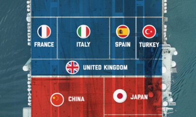
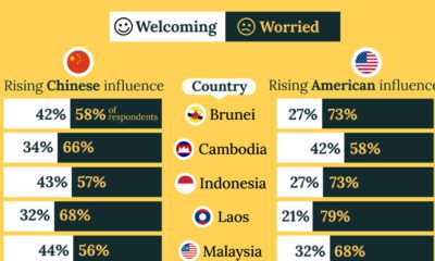
Charted: What Southeast Asia Thinks About China & the U.S.
A significant share of respondents from an ASEAN-focused survey are not happy about rising American and Chinese influence in the region.
-

 Politics3 weeks ago
Charted: Trust in Government Institutions by G7 Countries
How much do you trust the government and its various institutions? We look at data for G7 countries for the time period of 2006-2023.

-
 Mining2 weeks ago
Visualizing Copper Production by Country in 2023
-
 Markets1 week ago
Ranked: The Top 6 Economies by Share of Global GDP (1980-2024)
-
 Mining1 week ago
The Biggest Salt Producing Countries in 2023
-

 Crime1 week ago
Visualizing Global Losses from Financial Scams
-

 Maps1 week ago
Mapped: U.S. States By Number of Cities Over 250,000 Residents
-

 Business1 week ago
Charted: How the Logos of Select Fashion Brands Have Evolved
-

 United States1 week ago
Mapped: Countries Where Recreational Cannabis is Legal
-
War2 weeks ago
Visualized: Aircraft Carriers by Country