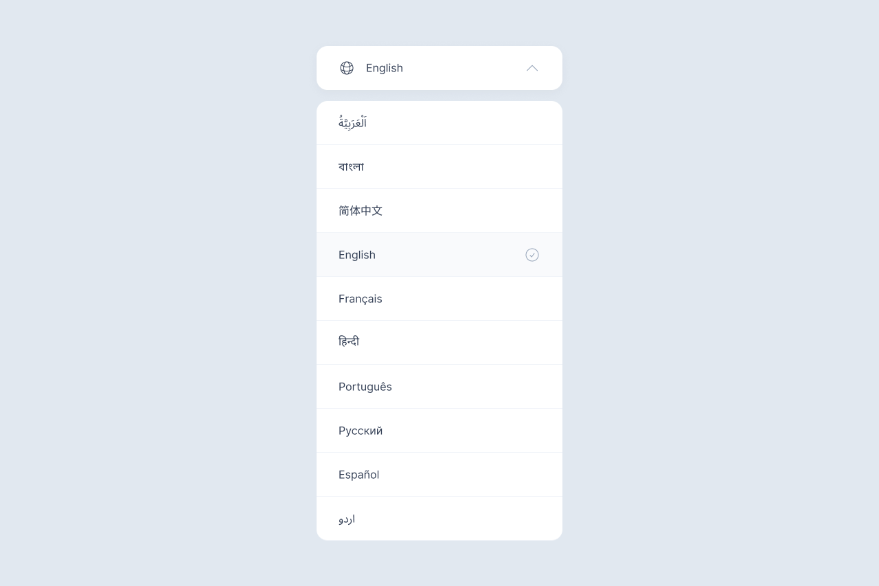
A logo is an essential part of any company’s identity. They come in all shapes and sizes, but they all have one thing in common; to aid and promote the identification of your business.
In a globalised environment, perceptions such as trust, quality, reliability, productivity, and many more attributes, are conveyed through symbols rather than words. A brand identity will bring employees closer together to make them feel like they belong in a team, or even a family. Companies that work across the world with many different destinations for their products and services need a brand to demonstrate coherence across everything they produce. A single identity will ensure that no matter where your products or services are being sold, they are being recognised.
Consumer behaviour is changing at a rapid pace and a brand identity solidifies a company’s appearance – it’s essentially the vehicle that communicates with its market. A great identifying attribute will create a connection between you and a consumer so that your products/services are recognised no matter where they’re found.
The importance of a brand identity is undeniable, and it starts with a logo. There are nine categories of logos, and each type has unique advantages and disadvantages depending on the type of business you have and the message you want to convey to your consumers. It’s worth taking the time to consider what type of logo you want before designing it, so read on to help determine what logotype is the best for your brand.
1. Pictorial mark
A true pictorial mark is an icon or image-based logo, specifically on its own without any text. You’ll find that established brands who use a pictorial mark as their logo are very well established and can be instantly recognisable from their logo.
A pictorial mark is not ideal for brand new companies, but if you do go ahead with using one to brand your business, ensure that you choose an icon that will stick through the lifetime of your company, keep it clean-cut and easy to remember, and ensure that it’s representative of your values.
2. Abstract mark
The abstract mark is a form of pictorial but avoids the literal representation of an object, therefore making the icon completely unique to your company. This means you can get playful and have no restrictions when it comes to designing your logo.
As the abstract mark is a design route to be taken for the long-term, ensure that your brand values are refined and detailed so that your logo can be a clear reflection and representation of that messaging.
3. Wordmark
A wordmark is a font-based logo with focus only on the business name itself, making it clear and easily transferrable for marketing purposes. A memorable name along with strong typography creates power and significance. For this, you need to choose or create a font that captures your business’ personality.
For example, legal and financial companies use heavy text to suggest strength and security, and luxury brands will likely use elegant fonts – attributes of the service that customers expect in these types of businesses.
4. Lettermark
If your company has a long name, its initials can be used and formed to create an identification of its own, so as to make an easier or more memorable way to be identified. A lettermark is usually a combined name established as a 3+ letter name, with a great example being NASA – The National Aeronautics and Space Administration. This logotype is effective and simple, streamlining the process of your customers getting to know your business.
If it’s important to have your business’ full name in the logo, it’s not uncommon to have the full name alongside the initials to ensure customer awareness. Adding the full name can solidify your brand even further, with the option to leave it off later on.
5. Combination mark
A combination mark is, you guessed it, a combination of both an icon and text and allows for some of the greatest versatility and variation options out of all the other types of logos. Layouts are limited only to the imagination, and are usually designed depending on how the logo needs to be used in marketing materials.
The ability to create multiple versions of your logo also grants you the capacity to develop your identity to continue inline with your company values over time. For example, once your brand achieves a certain level of recognition, you can drop the text part of the logo and just opt for the icon part as graphic images are more likely to be remembered than words.
This logotype, in particular, is exceptionally versatile and functional, so is frequently the common choice by business owners for their brand’s identity.
6. Mascot
Mascots are illustrated characters that stand in as a sort of spokesperson or ambassador for your business. Depicted as a warm character that’s often colourful and fun, the mascot personifies your company in order to easily convey brand messages to consumers. This usually appeals more often to families and children as the logo is a tangible character that these audiences can relate to. The mascot logo is sometimes adorned with text to ensure the connection with the mascot and brand name.
7. Emblem
This is where logotypes start to become more particular and overlap in their design attributes with other types. Emblems are considered to be an icon with text inside them, such as badges, seals and crests, traditionally fairly common for schools, universities, car companies, and food and beverage companies. They are usually comprised of a high level of detail, meaning that they can be difficult to change and update, but even with classic styling, recent years have seen rebrands of emblems with a modern and less-complicated approach.
Because of the complexity, details of the emblem can be lost if the logo needs to be small when applied in marketing materials. A way around this is to create variations of the same logo with different levels of detail for different application sizes, or to design the logo with less detail in the first instance so the same emblem can be applied in all situations.
8. Monogram
A monogram is a shorter version of a lettermark, usually found with up to 2 letters. This particular logotype often stands in for the initials of a person’s name or even a small signature. This option is used to convey style, luxury and exclusivity, and is also used by artists who brand themselves with their names.
9. Letterform
And lastly, letterforms are much like monograms, but are comprised of just one letter. Letterforms are becoming a much more popular option now and are largely used to compliment other logotypes as part of the larger brand identity. They are used mostly in digital or small print situations, such as for stamps, pins, app icons and favicons.